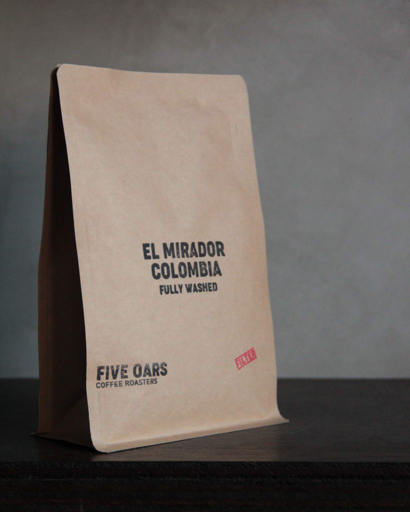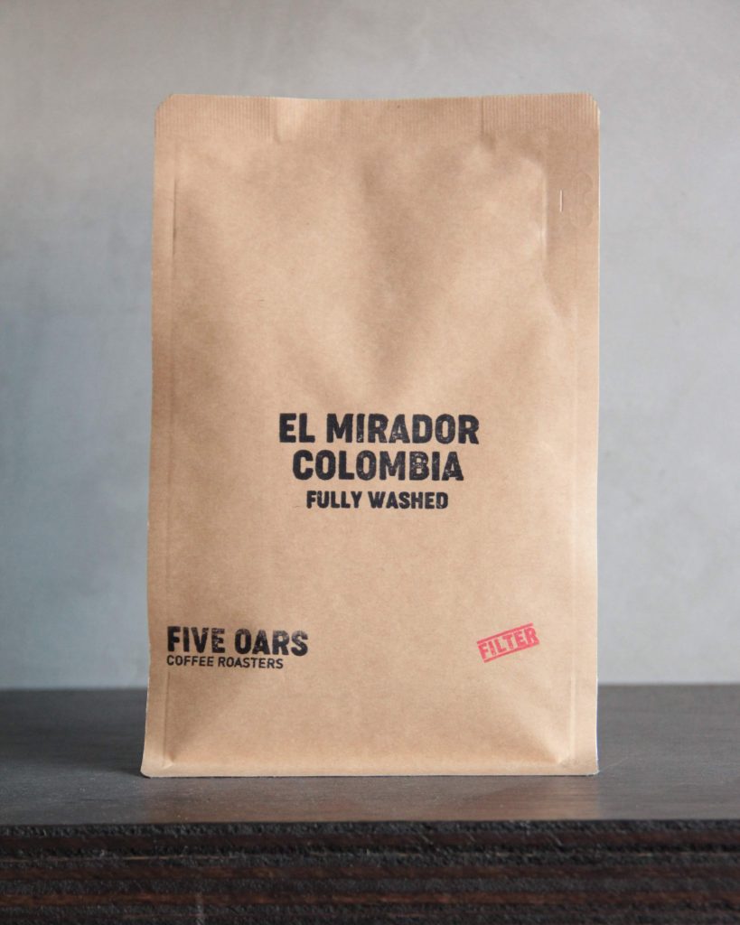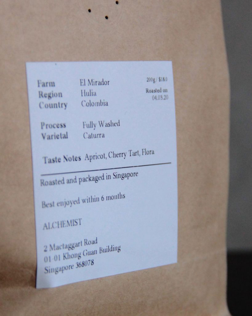
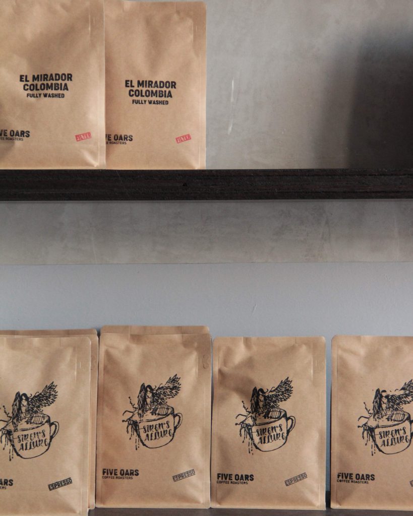
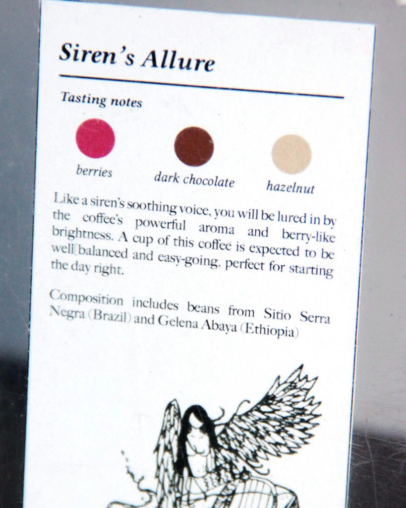
Simple and refreshing. This is how we would describe Five Oars Coffee Roasters’ brand identity which is reflected excellently in their packaging design. To start off, their logo has zero frills and is completely typographical. It appears on every whole bean bag with the name of the blend predominantly in the center. Their espresso bags, though, look a little more special. They show rough pencil-like sketches representing the specific story and flavor of it’s contents. Their Siren’s Allure espresso blend, for example, which is a combination of Brazilian and Ethiopian beans has an illustration of a winged mermaid sitting beside a harp on what appears to be a cup of coffee. The idea behind this is that just as one would be drawn to the beautiful singing voice of a siren, so will the bright and fruity aroma of this coffee draw you in. They even provide a little guide on the shelf to show you the tasting notes and the story behind each blend.
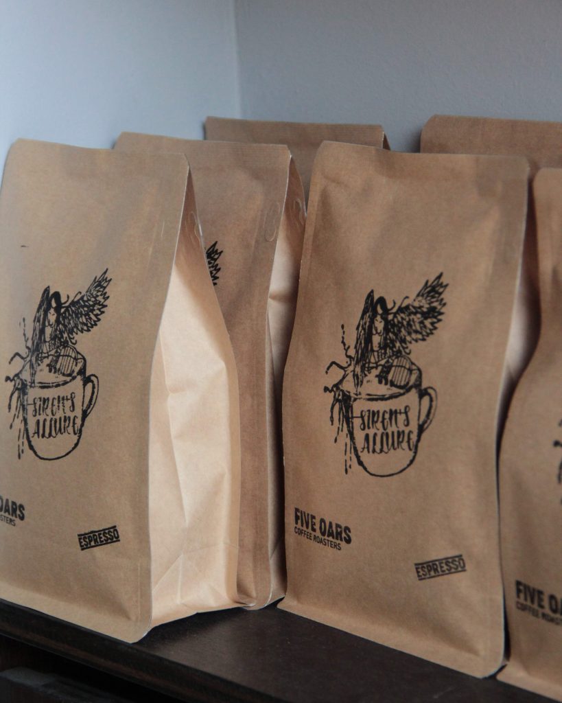
The general artistic direction of Five Oars may be pretty straightforward but it is worth mentioning that they stamp all these elements — the logo, the illustration and the label— by hand on every bag. If you look closely at the bags displayed on the shelves, only then will you notice that they are ever so slightly not 100% uniform, which, we think, adds soul and character to the packaging. That’s extra effort and attention to detail put in by the team at Five Oars that customers will often easily miss, but is, in fact, a very refreshing design aspect that makes it quite special.