For a company that is very open about their coffee story it might come as a surprise, that the design aesthetic Common Man Coffee Roasters chose for their UnCommon line is one that evokes mystery and exclusivity. This ‘show, don’t tell’ approach to packaging leads you to actually open it up to see what’s inside. There’s an extra layer of mystery in the experience, one that can also be described as luxurious.
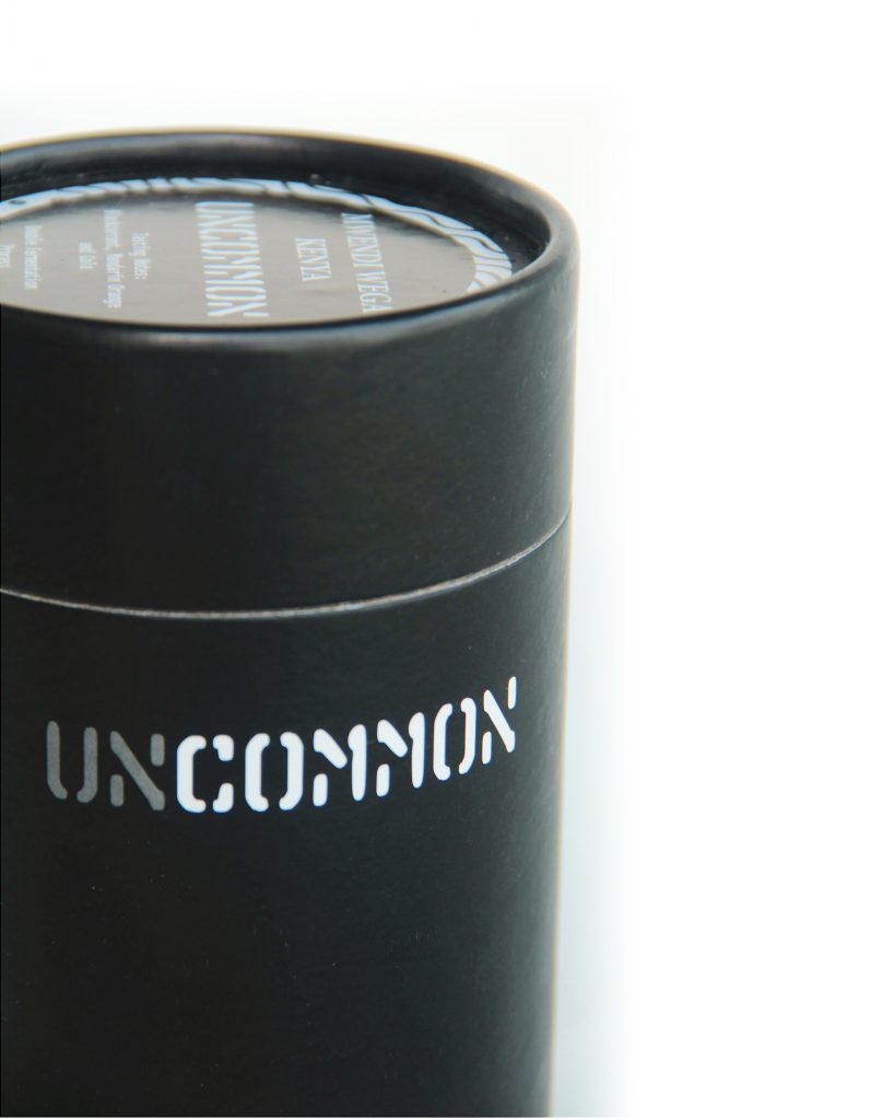
What is no mystery is that the designers behind Common Ground Coffee Roasters have a clear grasp of design principles. Their UnCommon line is a great example of crisp minimalism and exclusivity done right. The black cylinder has lettering for the UnCommon logo on the side is a creative way to utilize space; by making the first two letters grey while the rest are made white, both the company name and their product line are effectively showcased together in a witty manner.
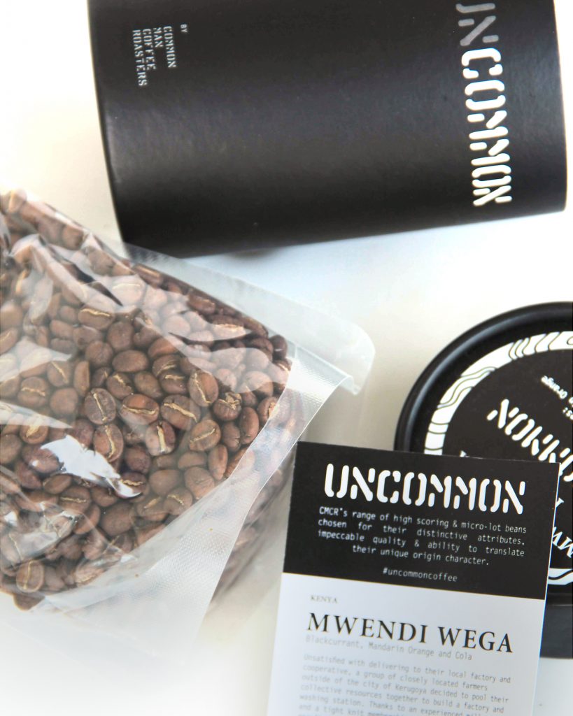
Coffee beans themselves are placed in a ziploc, vented bag, along with a small rectangular pamphlet containing detailed information about the product’s history. This pamphlet still follows the black-and-white aesthetic to tie everything together.
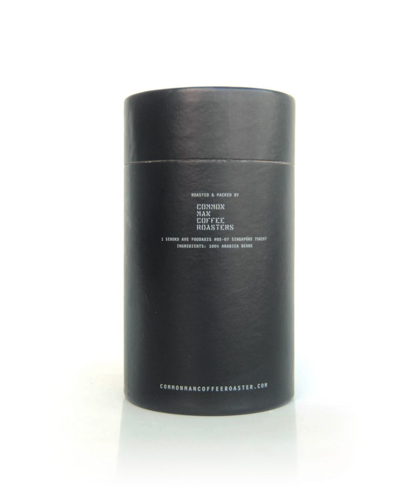
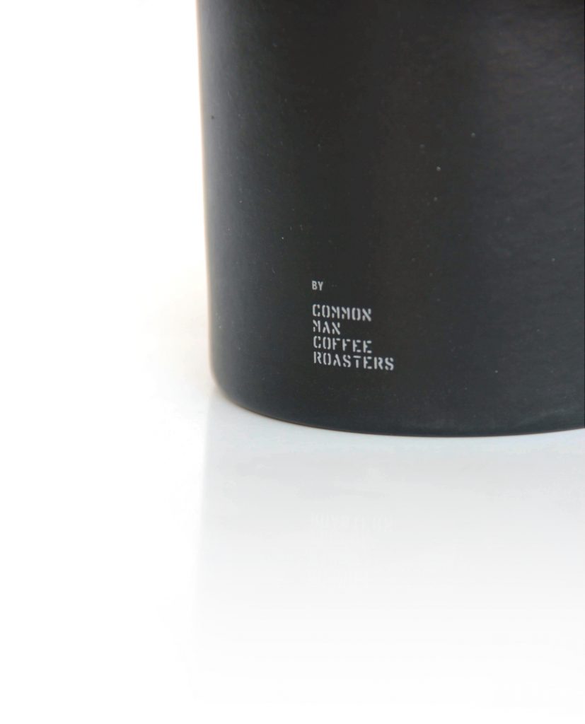
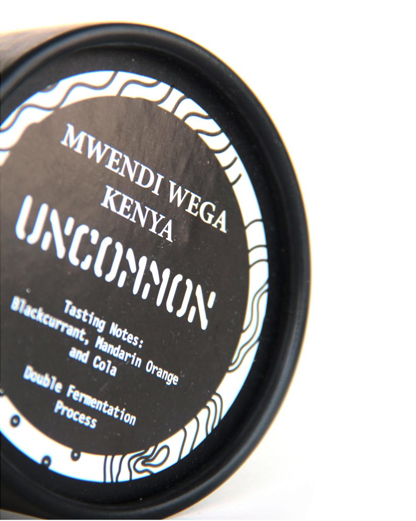
Aside from the logo, the only other elements that you will see around the container are the company’s full name, website, and address, all written in small grey text with a simple font style. The lid is where the design loosens up a bit, through incorporating CMCR’s trademark topography-map-like patterns in a frame around a label, which contains the source of the coffee beans and the tasting notes to be expected from the product. The topographical elements brings in another key message to the label design: elevation.