Homeground Coffee is one of those companies that give importance to good design, perhaps just as much as they pay attention to the quality of the coffee they produce. They are known for coming up with creative and playful illustrations and images for their coffee packaging. It’s also interesting to see how often they experiment with different styles and color schemes without losing their identity.
We appreciate it when coffee companies put effort in their packaging design. It shows that they care and pay close attention to how their product comes across from the shelves. Whether we are aware of it or not, design and aesthetics do affect and influence how we choose and buy almost anything.
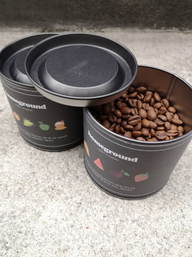
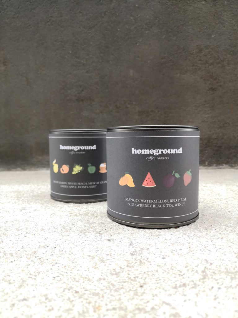
Let’s take these tins, for example. These are what Homeground Coffee use for their regular roasts. The tin itself is already nice. They chose a gunmetal color that looks basic but classy and covered it with a label in almost the same shade. Text is very minimal but they added tiny illustrations showing the different flavor notes you’ll get from the beans inside. The illustrations are colorful so they really pop out. It’s the kind of design in which they only show you what you need to know and does it well. It’s straight to the point without being too serious.
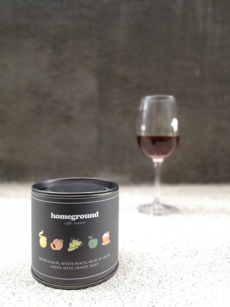
It also looks modern but is easily appealing to any person of any age. Another detail worth taking note of is how they’ve kept font sizes very readable and not too small, which is usually a problem with minimalist designs. Nothing is compromised. And these are things you only think of when design is important to you. Homeground Coffee sure does show us that.