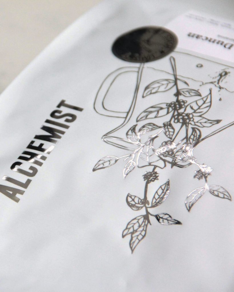
Stylish and elegant. For such a simple bag of coffee, it’s easy to see how much thought was put into designing the packaging of Singapore’s Alchemist coffee roastery. We chanced upon 2 special offerings on the week of our visit, namely the Kotowa Duncan (pictured in white) and Oaklands PB (in black). Sporting a somewhat minimalist design, each parcel has a prominent hand-drawn illustration in a reflective spot-foil finish accompanying the Alchemist logo lockout.
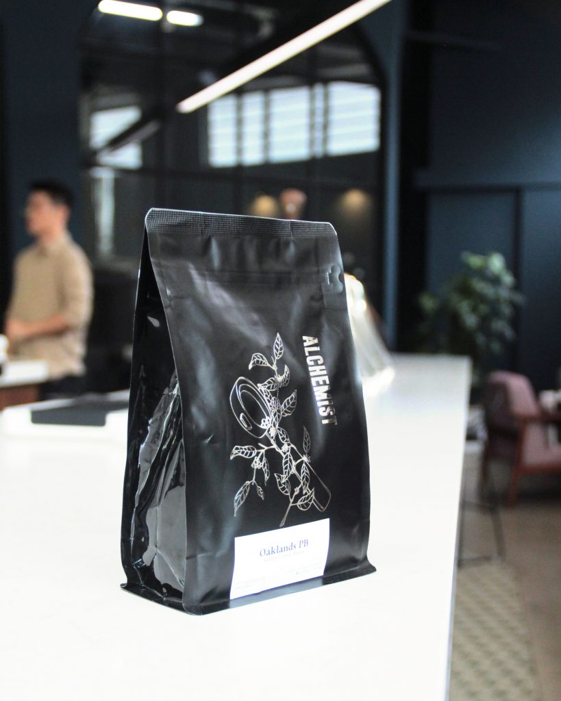
For Espresso blends, the illustration is that of a portafilter wrapped in a coffee plant. For drip or filter offerings, the same plant makes an appearance, but this time planted in a pour over carafe. For coffee enthusiasts like us, we appreciate the value added to our experience of the beans, since the packaging itself even works as a souvenir and gives clear cues as to what flavors experiences to expect before even reading the words.
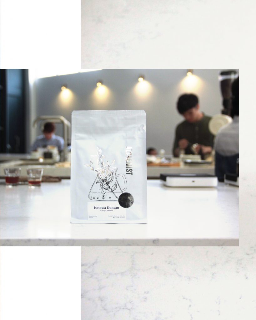
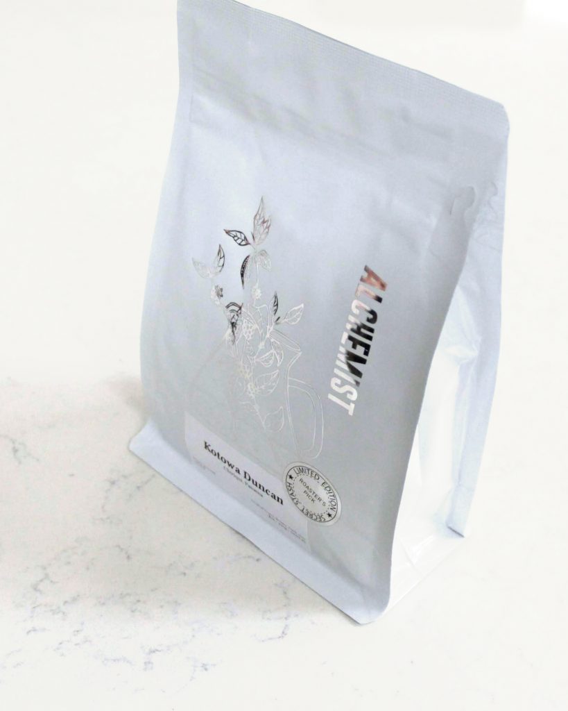
A label can also be found under the illustration, detailing the name in bold lettering and the place of origin for the encased beans. In even smaller letters, we can read its processing method and varietal classification, plus the description of the taste we can expect once we brew our own cup back home.
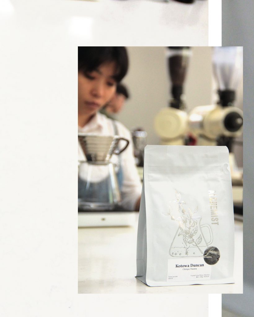
The overall layout of Alchemist’s packaging is already a treat on its own, setting high expectations of the coffee quality once we open it up. In the case of the Kotowa Duncan, it is also marked with a Limited Edition seal, a hint for us to consider purchasing it before heading to the exit. Each coffee has its own pricing, so that is also indicated on the label. It’s a small detail that goes a long way in removing a barrier to entry for some potential customers.